Decoding the Nighthawks Logo: A Deep Dive into Game Art
Discover the secrets behind the Nighthawks logo and the noir aesthetic of The Curiosity Engine's vampire RPG. Explore branding, art style, and design tips.
Published:
Table of Contents
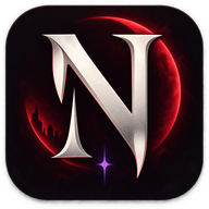
In the rain-slicked streets of a modern metropolis where vampires have finally come out of the shadows, branding is everything. The nighthawks logo serves as the definitive visual anchor for The Curiosity Engine's ambitious RPG, setting a tone that is simultaneously sophisticated, predatory, and deeply noir. For players diving into this narrative-heavy world, the nighthawks logo isn't just a marketing asset; it is a symbolic representation of the game's core themes—power, secrecy, and the struggle for survival in a society that fears the supernatural. Understanding the design choices behind this iconography provides a window into the development philosophy of Richard Cobbett and his team.
Quick Branding Insight
The visual identity of Nighthawks relies on high-contrast noir elements, utilizing a minimalist yet aggressive typography that mirrors the game's themes of urban vampirism and political intrigue.
The Visual Language of Urban Vampirism
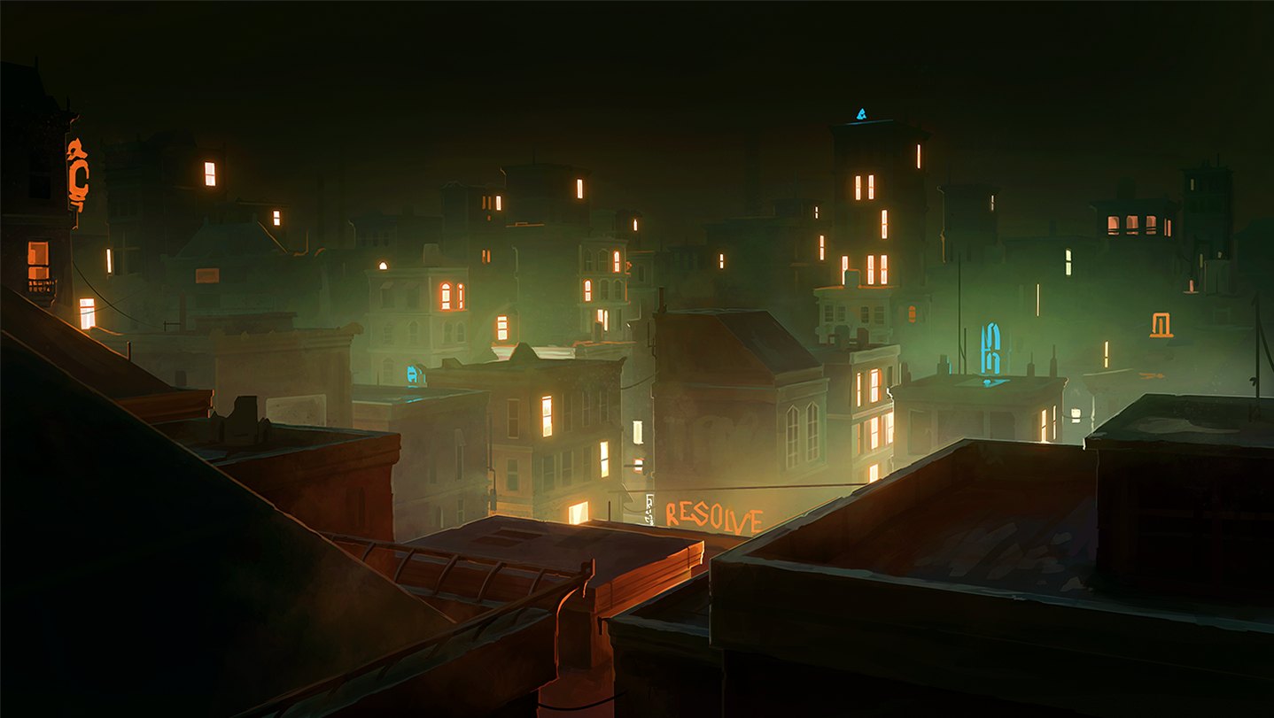
The aesthetic of Nighthawks is built upon the foundation of "Modern Noir." Unlike traditional gothic horror which relies on crumbling castles and Victorian lace, this game positions its supernatural elements within the neon-lit confines of a contemporary city. The nighthawks logo must bridge the gap between these two worlds. It needs to feel at home on a high-end nightclub flyer while still whispering of ancient, blood-bound traditions.
When analyzing the logo, one immediately notices the sharp, angular lines. In design theory, sharp angles are often associated with danger, precision, and modernism. This is a deliberate departure from the rounded, organic shapes found in high-fantasy titles. According to community reports and developer interviews, the goal was to create a "corporate-occult" look—something that feels like a brand you might see on a skyscraper owned by a vampire CEO.
Visual Element
Design Intent
Psychological Impact
High Contrast (Red/Black)
Represents blood and shadow
Evokes immediate tension and alertness
Sharp Serif Typography
Modern but rooted in tradition
Suggests sophistication with a "bite"
Minimalist Iconography
Focuses on the "Nighthawk" bird/eye
Creates a sense of being watched
Neon Accents
Connects to urban nightlife
Establishes the modern setting
Analyzing the Nighthawks Logo Design Components
Every successful game logo consists of three primary layers: the wordmark, the symbol, and the color palette. The nighthawks logo excels by keeping these layers distinct yet harmonious. The wordmark utilizes a custom-styled font that emphasizes the verticality of the letters, mimicking the towering skyscrapers of the game's setting.
The "Nighthawk" itself is a clever play on words. While it refers to the nocturnal nature of vampires, the bird of prey motif suggests a creature that is observant and lethal. In branding circles, this is known as "associative identity." By using a bird of prey as the central figure, the developers bypass the overused bat imagery common in the genre, giving Nighthawks a unique footprint in a crowded market.
Typography and Weight
The weight of the font in the nighthawks logo is crucial. It is heavy enough to command attention on a Steam storefront but spaced widely enough to feel "airy" and mysterious. This balance is difficult to achieve; too thin, and the logo loses its authority; too thick, and it feels like an action-shooter rather than a narrative RPG.
The Role of Negative Space
One of the most praised aspects of the game’s UI, according to player experience threads, is the use of negative space. The logo often appears as a silhouette or a cutout, allowing the background textures of the city—rain on glass, flickering neon, or dark alleyways—to bleed through. This makes the logo feel like a part of the environment rather than a sticker placed on top of it.
Font Characteristic
Effect on Player Perception
Why it Works
Extended Kerning
Creates a sense of luxury and space
Fits the "elite vampire" narrative
Vertical Elongation
Mimics urban architecture
Grounds the game in its city setting
Subtle Distressing
Suggests a world with history and grit
Prevents the logo from looking too "clean"
Branding in Narrative-Driven RPGs
In a game where your choices dictate the political landscape of a city, the visual identity must feel "permanent." The nighthawks logo acts as a seal of quality for the narrative. When players see that branding, they expect high-quality writing and complex moral choices. This is a technique used by many top-tier indie developers to build "brand equity."
Community discussions often highlight how the logo’s evolution through development mirrored the game's shifting tone. Early iterations were reportedly more traditional, but as the game leaned harder into the "vampire public relations" aspect, the logo became slicker and more corporate. This change reflects the player's journey from a lowly fledgling to a power broker in the city.
Why Branding Matters for Immersion
Consistency: Seeing the logo on loading screens, UI menus, and social media creates a unified experience.
Tone Setting: Before a single line of dialogue is read, the logo tells the player the game is mature and serious.
Recognition: In the sea of indie games on Steam, a strong logo is the first line of defense against being overlooked.
For Content Creators
When using the nighthawks logo in thumbnails or stream overlays, maintain the high-contrast red and black theme. Adding a subtle "glitch" effect or a neon glow can enhance the urban noir vibe without compromising the original design.
Comparing Nighthawks Visuals to Genre Peers
To truly appreciate the nighthawks logo, one must look at how it stands against its contemporaries. The vampire subgenre is diverse, ranging from the gothic horror of Castlevania to the punk-rock aesthetic of Vampire: The Masquerade - Bloodlines.
Game Title
Primary Visual Theme
Logo Style
Key Color
Nighthawks
Urban Noir / Political
Sleek, Corporate, Sharp
Crimson / Onyx
Vampire: The Masquerade
Gothic Punk
Grunge, Ornate, Chaotic
Blood Red / Green
Vampyr
Edwardian / Medical
Classic Serif, Distressed
Deep Red / Grey
BloodRayne
Action / Pulp
Aggressive, Metallic
Bright Red / Chrome
As seen in the table above, Nighthawks carves out a niche by focusing on the "Sleek/Corporate" side of the spectrum. This aligns perfectly with the developer's goal of exploring what happens when vampires become a regulated part of the modern economy. The nighthawks logo doesn't scream "horror"; it speaks of "influence."
Technical Specs and Asset Management for Fans
For the modding community and fan artists, the nighthawks logo is a frequent subject of recreation. Understanding the technical aspects of the logo helps in producing high-quality fan content that respects the original vision of The Curiosity Engine.
Most official assets for the game use high-resolution PNGs with transparency to allow for layering. The logo is typically rendered in a way that supports "responsive design"—meaning it looks just as good as a small icon in a taskbar as it does on a giant billboard in a cinematic trailer.
Best Practices for Using Game Assets
Maintain Aspect Ratio: The nighthawks logo relies on its specific horizontal stretch; never squish it to fit a square frame.
Color Accuracy: Use the specific hex code for "Nighthawk Red" (usually a deep, desaturated crimson) rather than a bright primary red.
Background Contrast: Avoid placing the logo on busy, multi-colored backgrounds. It thrives on dark, moody textures.
Format
Recommended Use
Pros
SVG (Vector)
Large scale printing / 4K monitors
Infinite scalability without quality loss
PNG (Transparent)
Web overlays / UI mods
Supports alpha transparency for layering
JPG
Social media posts
Small file size for quick loading
The Impact of "Nighthawks" as a Brand Name
The choice of the name "Nighthawks" itself is a masterclass in evocative branding. It carries multiple layers of meaning:
The Bird: A predator that hunts at night, symbolizing the vampire.
The Painting: A nod to Edward Hopper’s famous Nighthawks, which captures the loneliness and alienation of urban life—a central theme in the game.
The People: A term for those who are active at night, perfectly describing the game's cast.
The nighthawks logo has to encapsulate all these meanings into a single glance. By focusing on a sharp, modern typeface, the designers lean into the "Hopper-esque" loneliness while maintaining the predatory edge of the bird. This multi-layered approach to branding is what separates professional game design from amateur projects.
Common Mistakes in Fan-Made Branding
When the community attempts to create their own versions of the nighthawks logo, a few common errors tend to crop up. Avoiding these ensures that your fan projects feel "official" and align with the game's high standards.
Over-decorating: Adding too many bats, blood drips, or fangs. The actual game logo is sophisticated and avoids these clichés.
Incorrect Font Choice: Using a standard "horror" font like Chiller or something overly gothic. The game uses a modern, high-fashion style font.
Brightness Overload: The world of Nighthawks is dim. Using high-brightness neon that washes out the logo ruins the noir atmosphere.
Identity Confusion
Do not confuse the game's logo with various sports teams (like the NNU Nighthawks) or aviation logos. The game's identity is strictly rooted in urban noir and narrative RPG tropes. Always verify you are using assets from The Curiosity Engine.
The Future of The Curiosity Engine’s Branding
As Nighthawks continues its journey through the gaming landscape, the nighthawks logo will likely become a symbol of a specific type of narrative excellence. The Curiosity Engine has established a visual shorthand that tells players exactly what to expect: a smart, dark, and adult take on the vampire mythos.
Looking forward, we may see variations of the logo for DLC or sequels. The strength of the current design lies in its flexibility. It can be easily adapted—perhaps a "broken" version for a story about the collapse of vampire society, or a "gold-leafed" version for a story about the ultra-wealthy elite.
FAQ: Everything You Need to Know About the Nighthawks Logo
Where can I find the official nighthawks logo for fan art?
The best place to find high-quality assets is the official Steam press kit or the developer's social media pages. Always ensure you are looking for Nighthawks by The Curiosity Engine to avoid confusion with other brands using the same name.
What font is used in the nighthawks logo?
While the exact font is often a custom-modified typeface, it draws heavy inspiration from modern, high-contrast serifs used in fashion and luxury branding. It is designed to look sharp, elegant, and slightly menacing.
Why does the nighthawks logo use red and black?
Red and black are the quintessential colors of the vampire genre, representing blood and night. However, in this specific logo, the red is often used as a neon accent, which grounds the supernatural elements in a modern, urban setting.
How does the logo reflect the game's "Noir" themes?
The logo uses high contrast, sharp angles, and lots of negative space. These are all hallmarks of Noir design, intended to create a sense of mystery, danger, and urban isolation, mirroring the experience of playing a vampire in a hostile city.